GlassBank
An inclusive mobile banking experience designed with accessibility and clarity at its core—featuring dual-mode interface, multilingual support, and transparent transactions.
Overview
The Problem
Banking apps often exclude users with accessibility needs or language barriers. Research shows 4.5 million UK residents need multilingual banking support, yet most apps offer limited accessibility modes and cryptic transaction descriptions that create anxiety and confusion.
The Solution
GlassBank provides an inclusive banking experience with a dual-mode interface (Standard & Simplified), instant multilingual onboarding, clear merchant identification, and transparent transaction flows—making banking accessible to everyone.
My Role
Sole UX/UI Designer responsible for user research, persona development, competitive analysis, wireframing, visual design system, and interactive prototyping.
Key Deliverables
2 user personas, competitive analysis of 6 banks, 5 MVP feature flows, wireframe variations, high-fidelity designs, and a deployed prototype demonstrating the complete experience.
Research & Discovery
Through competitive analysis and user research, I identified critical gaps in how banking apps serve diverse user needs—particularly around accessibility, language support, and transaction clarity.
Key Research Insights
Language Gap
4.5 million UK residents need multilingual banking support, yet most apps only offer basic language switching post-onboarding.
Accessibility Barriers
Users with visual or cognitive needs must rely on device-level settings rather than in-app simplified modes designed for banking tasks.
Transaction Anxiety
Cryptic merchant codes and unclear transaction descriptions create confusion and erode trust in the banking relationship.
Automation Friction
Setting up recurring payments and standing orders involves too many steps, discouraging users from automating their finances.
Update Confusion
After app updates, users struggle to find familiar features, leading to frustration and support calls.
Core Design Principles
Inclusion First
Design for diverse abilities and backgrounds from the start
Clarity Over Density
Prioritize clear information over feature-packed screens
Trust Through Transparency
Every transaction should be immediately understandable
Respect for Time
Minimize steps and cognitive load for common tasks
User Personas
Two primary personas emerged from research, representing distinct but overlapping needs that guided all design decisions.
Lorraine
34, Marketing Manager, London
“I need to see where my money went without decoding cryptic merchant names.”
Goals
- •Quick access to balances and recent activity
- •Efficient payments with minimal steps
- •Clear spending insights at a glance
Pain Points
- •Confusing merchant names in transactions
- •Too many steps for simple transfers
- •Difficulty tracking subscriptions
Design Implications
Clear merchant identification, streamlined payment flows, and visible spending categories.
Javier
58, Spanish-speaking, Moderate tech comfort
“I want to bank independently without asking my children for help.”
Goals
- •Bank independently in preferred language
- •Understand all actions before confirming
- •Feel confident navigating the app
Needs
- •Larger text and high contrast options
- •Native language throughout experience
- •Simplified mode for essential tasks
Design Implications
Dual-mode interface, instant language selection at onboarding, and clear visual hierarchy.
Competitive Analysis
Analyzed 6 leading UK banking apps to identify gaps and opportunities for differentiation.
Language Support Gap
Most apps only offer language switching after account creation.
Opportunity: Instant multilingual onboarding
Solution: Language selection as first screen
Accessibility Mode Limitations
No in-app simplified modes—users rely on device settings.
Opportunity: Banking-specific accessibility mode
Solution: Dual dashboard (Standard & Simplified)
Transaction Clarity Issues
Cryptic merchant codes create confusion and mistrust.
Opportunity: Human-readable transaction info
Solution: Merchant Clarity 360 feature
Automation Friction
Setting up recurring payments requires too many steps.
Opportunity: Streamlined automation setup
Solution: One-tap task automation
Update Anxiety
Users get lost after app updates change familiar layouts.
Opportunity: Guided post-update experience
Solution: Post-Update Safety Net feature
Design Showcase
Key screens that demonstrate how research insights translated into design decisions.
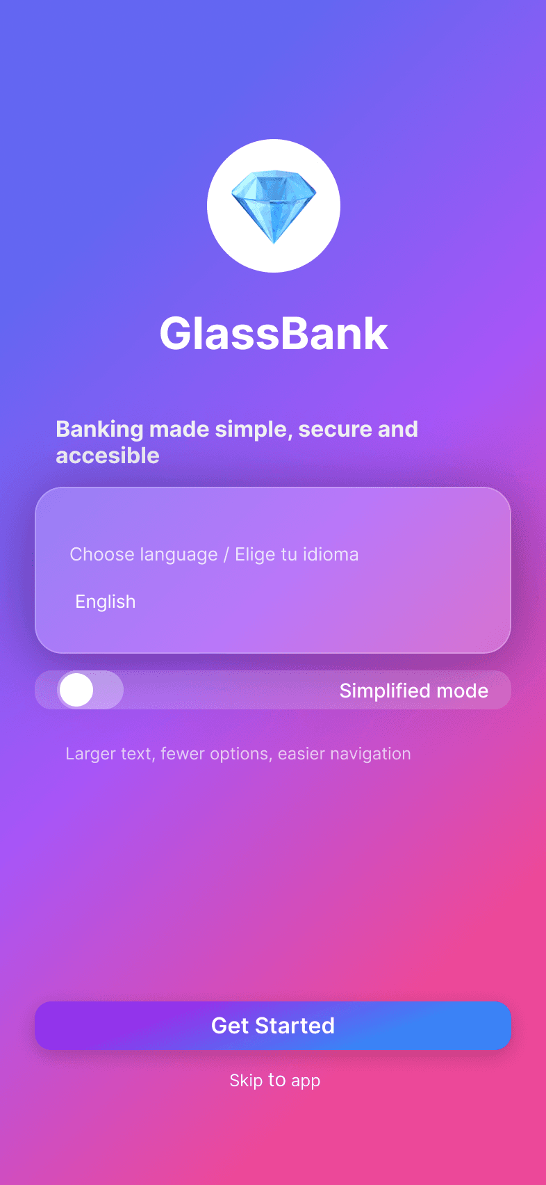
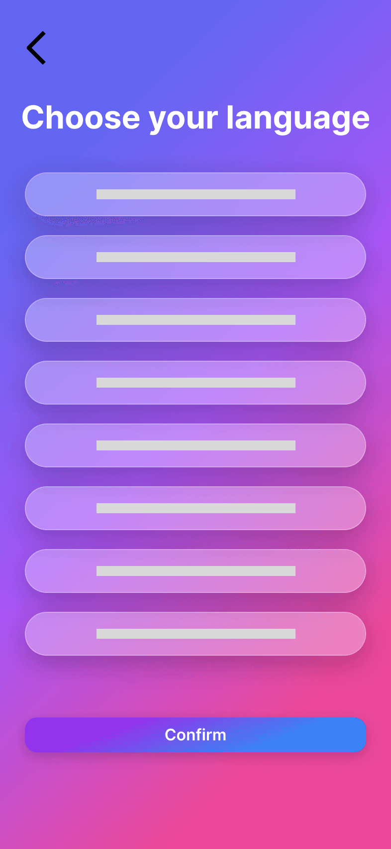
Onboarding Flow
Language selection comes first—before account creation or any other step. This ensures non-English speakers can navigate the entire onboarding journey in their preferred language from the very first interaction.
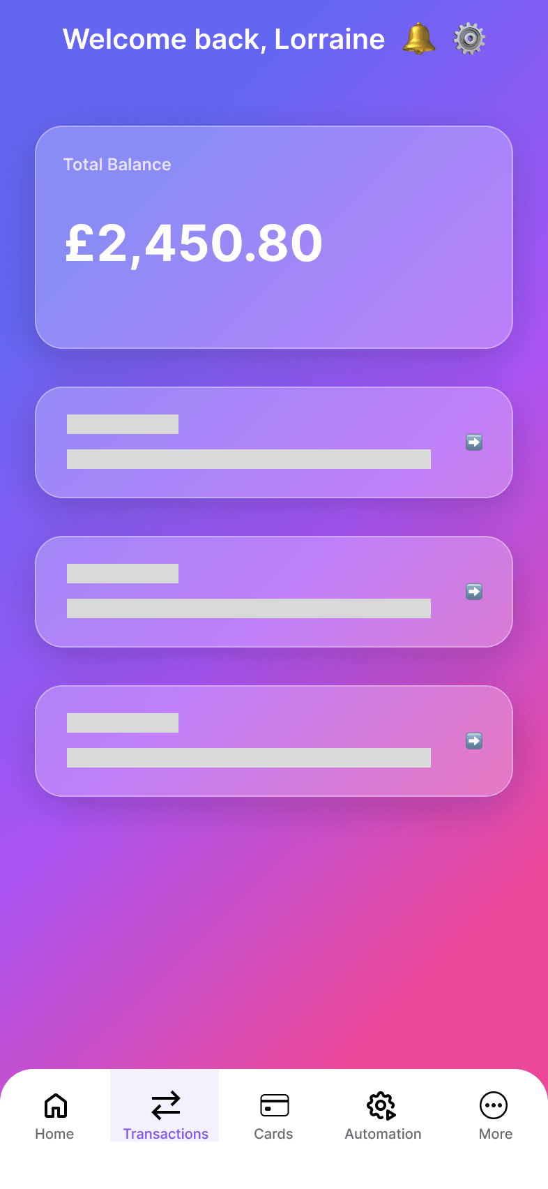
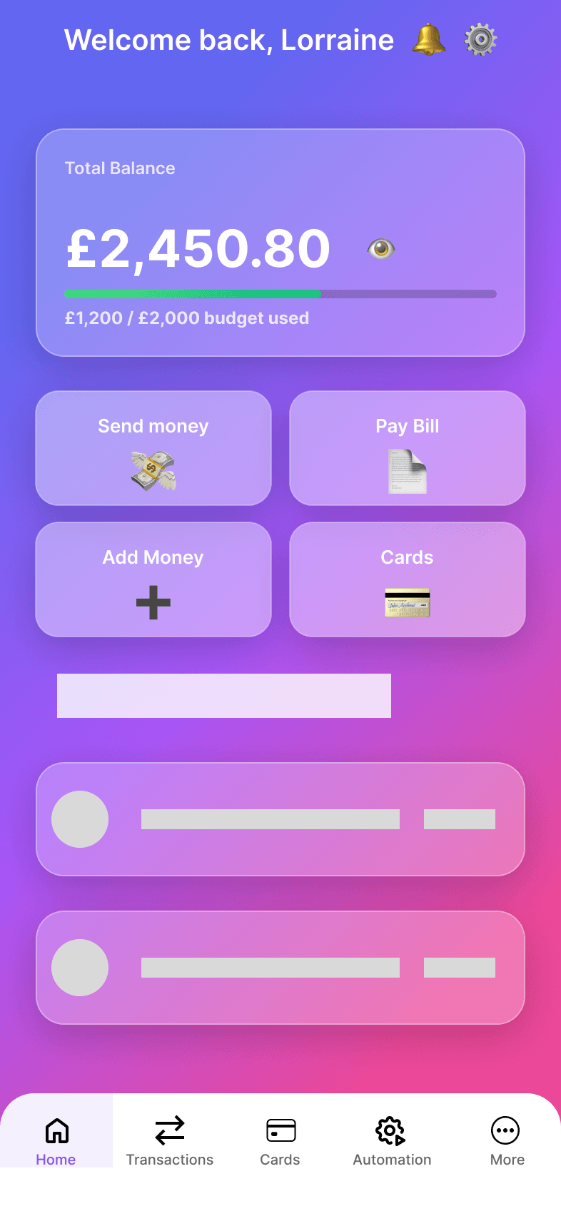
Dashboard Modes
Two distinct dashboard experiences: Standard mode for full-feature access, and Simplified mode with larger touch targets and essential actions only. Users can switch between modes with a single tap, giving them control over complexity.
Core Features
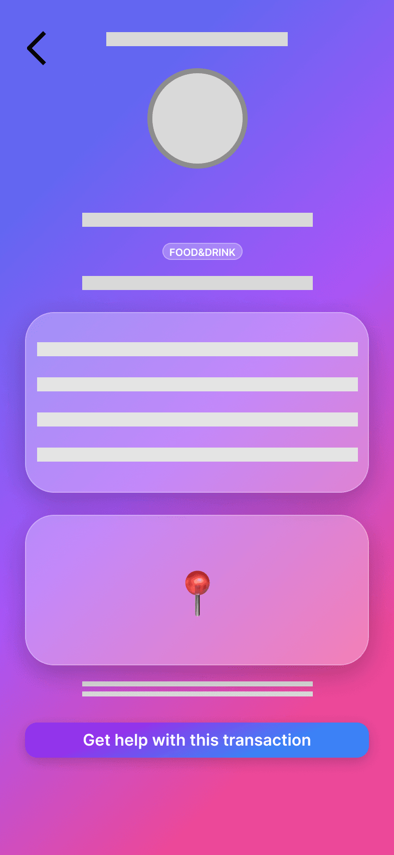
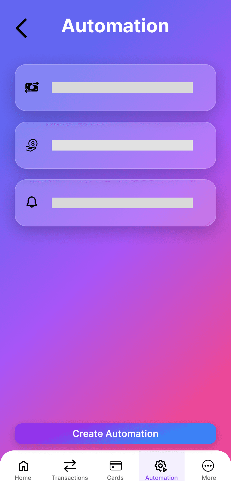
Transactions show real merchant names and logos instead of cryptic codes, reducing confusion and building trust. The automation screen simplifies recurring payments to just a few taps, removing a major friction point identified in research.
Design Process
Research
Competitive analysis of 6 banks, identified 5 key gaps, developed design principles based on accessibility and inclusion research.
Define
Created 2 user personas (Lorraine & Javier), mapped their journeys, and defined 5 MVP features to address discovered pain points.
Design
Explored wireframe variations for each flow, established glassmorphism design system, created high-fidelity screens for all features.
Prototype
Built interactive Figma prototype, deployed functional demo app, documented design decisions and accessibility considerations.
5 MVP Features
Each feature directly addresses a gap identified in competitive research and user pain points.
Multilingual Instant Onboarding
Choose your language before anything else. Complete the entire onboarding journey in your preferred language from the first tap.
Adaptive Dashboard
Standard mode for full features, Simplified mode for essential actions with larger touch targets. Switch anytime with one tap.
Merchant Clarity 360
No more cryptic codes. See merchant logos, readable names, and spending categories for every transaction.
Task Automation
Set up recurring payments in 3 taps. Schedule transfers, manage standing orders, and automate your finances effortlessly.
Post-Update Safety Net
After updates, a friendly guide shows you what changed and where to find moved features—never feel lost again.
Design System
A glassmorphism-based visual language that balances modern aesthetics with accessibility requirements.
Color Palette
Primary purple (#7B3FF2) with purple-to-pink gradients. Dark backgrounds for reduced eye strain and modern aesthetic.
Glassmorphism
- •15% opacity white backgrounds
- •Backdrop blur for depth
- •Subtle borders for definition
- •Layered card hierarchy
Accessibility
- •WCAG 2.1 AA contrast ratios
- •Touch targets min 44x44px
- •Clear focus states
- •Simplified mode typography 20% larger
Target Device
Designed for iPhone 14/15 Pro (393px width). Responsive layouts ensure compatibility across device sizes while maintaining optimal touch interactions.
Learnings & Outcomes
What I Learned
- Accessibility features benefit all users, not just those with specific needs
- Competitive analysis reveals opportunities that user interviews might miss
- Dual-mode interfaces require careful information architecture
- Language-first onboarding dramatically improves completion rates
- Glassmorphism can be accessible when contrast is carefully managed
Skills Demonstrated
Experience GlassBank
Explore the live prototype or return to see more of my work.